Vivre Cacao

Date
February–March 2017 ~5–6 weeks
Role
Creator, Designer, Photographer, Illustrator
Deliverables
Branded chocolate packaging
Brand Characteristics
Luxury, serious, exotic
OVERVIEW
Luxurious design for organic and fair-trade chocolate
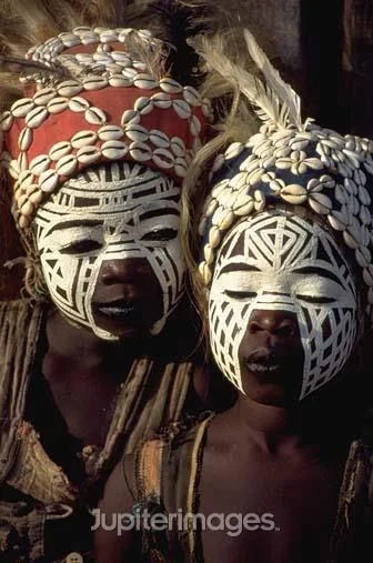
Vivre Cacao is a conceptual project that involved incorporating and portraying elements of organic and fair-trade consumerism. The goal was to design a fair-trade chocolate brand that was organic and was from/inspired by countries who supply the world’s main supply of cacao. For my concept, I focused on the production of cocoa in Côte d’Ivoire which historically has been exploited for cocoa production. I chose to base this project on the Ivory Coast because during my research I was inspired by the color and pattern traditional to the culture.
Target Audience
The target audience of this product are people from 25+, who have more disposable income & don’t mind paying more for a “luxury” product, care about the fair treatment of workers especially from third world countries/ those under represented. People who have interest in trying exotic flavors.

Challenge
The parameters of this project were to brand a chocolate company that would represent fair trade and organic chocolate.
Process
Research & Moodboard


The Name
Brainstorming the name of the brand was an interesting task. The official language spoken in the Ivory Coast is French, so naturally the name should be something in French. The final proposed name was “Vivre Cacao” which means live cocoa, and in that line of thought experience cocoa.


The Mark
The look and feel of the brand is meant to feel more luxurious but still represent an idea of a fair trade and organic product so the logo type was created to look more organic and have a sense of flow within the letters while still staying structured and clean.
Packaging
When designing the actual box for the chocolate something more atypical of a chocolate box was desired. The final box shape to make it bolder was an A-frame pillow box die-line that was modified to have a wider bottom to make room for more chocolate.
The main pattern design is inspired by traditional face painting patterns from a local tribe in the Ivory Coast that grows cocoa. The side panels were also decorated with reference images on the side panels. There was also an intention of creating more die-cuts in the side instead of the images, but it was decidedly better to just leave the die-cut highlight on the front of the box.
Box Elements


Variation
The different flavors of chocolate were chosen based on local foods and crops that are commonly consumed in the Ivory Coast. Through research and consideration on what these flavors might actually taste like the flavors – pineapple, plantain chips, and coffee were chosen.
The highlight colors chosen to show behind the die-cuts were chosen based on their relation to the flavors as well as taken from the inspiration and mood board images. Pineapple was given a bright yellow color to represent the flesh of the fruit. Coffee was given a muted orange color which most closely resembled the color of coffee as well as matching with the color pallet from the research and mood board. This shade of orange was also chosen to go well with the other colors while still being bold enough from the darker brown of the box. Plantains, a type of banana which generally stay green and unripe for a long time before ripening, were given a green color to differentiate from the yellow given to pineapple.
Putting it All Together


Final Deliverables
Logo


Typeface

Color Palette


