The Earthling Co.
OVERVIEW
Employed
February 2021-August 2023
Role(s)
Senior Graphic Designer || February 2023-August 2023
Graphic Designer || February 2021-February 2023
Deliverables
Branding, Packaging, Promotional Assets, Social Content, Illustrations
The Earthling Co. aims to create a positive impact on daily routines and the future of our planet. By creating safe, sustainable products that won’t contribute to the growing waste problem.
We create thoughtfully designed products that nurture and simplify eco-conscious routines
Branding
One of the larger projects coming onto this team was creating brand guideline documents which required collaborating with the founder to define, refine, and provide art direction to what the brand would look like moving forward.
Big portions of the rebrand included redefining and providing art direction and moodboards for photography and shoots and leading a redesign of all of the existing packaging.
Photography direction inspiration & Moodboard
Packaging photography direction for the brand is bright, light and approachable. Choosing an eco-friendly option is not always the easiest nor the cheapest option, so integrating photography that is open and easy to digest for a wide of audiences was a big goal. We did not want to use overly stylized photography which may feel alienating to some audiences.
Illustrations - For social and web usage
Illustration style for the brand is also designed with an “approachable” mindset. Icons and graphics are organic yet clean and concise and not overly stylized to be easily digestible.
Packaging
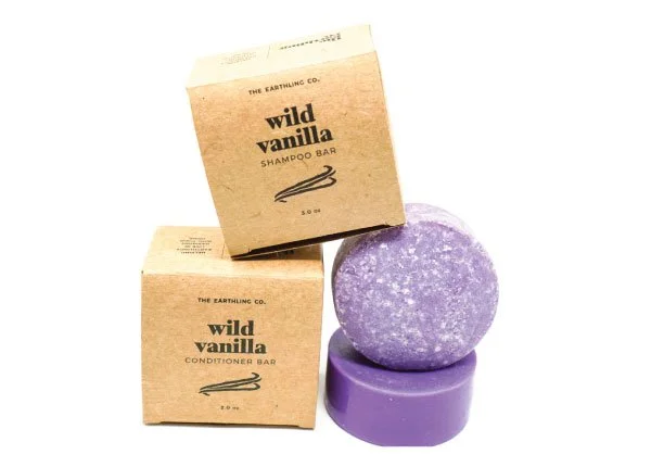
Before
Old Packaging
After
New Packaging
Redesigning the packaging — The packaging needed to retain the same elements that showed the products were natural, eco-friendly, and sustainable. While also elevating the packaging and creating a more eye-catching design overall.
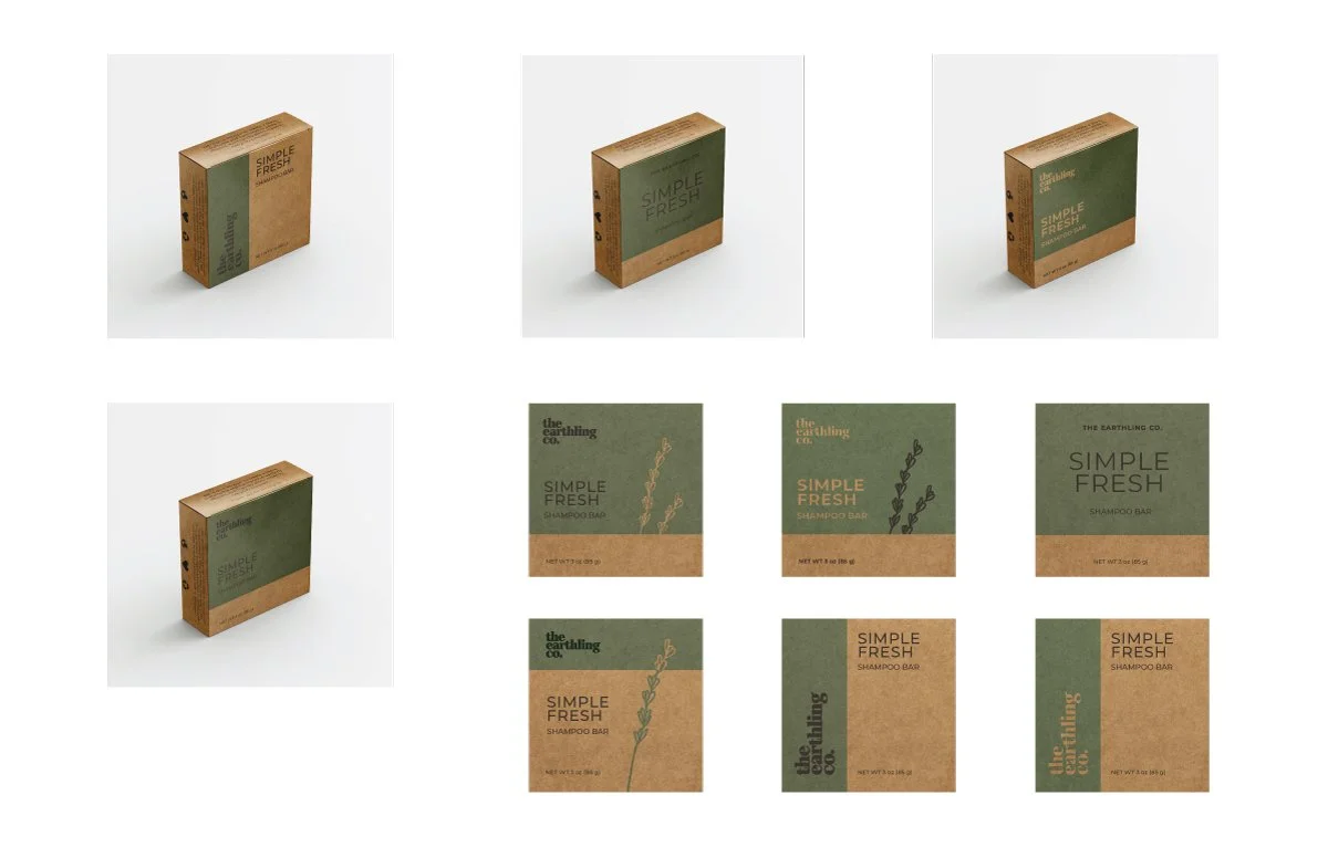
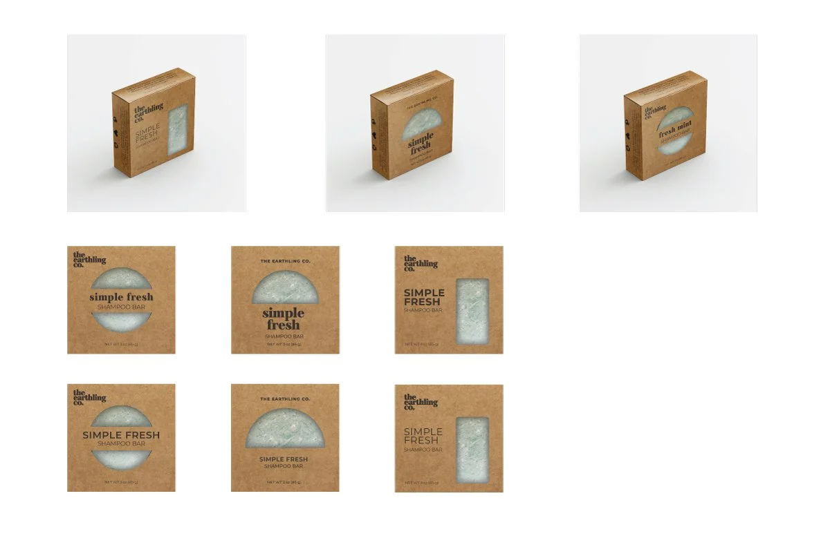
Initially, we played around with 2 different ideas. 1. To use a color block to play with more color while pulling inspiration from the colors of the shampoo & conditioner bars. or 2. Utilize a die-cut in the design to physically reveal a color pop from the bar inside.
Design exploration with color block and illustrative elements
Die-cut design exploration
Ultimately, a color block design paired with an illustration was chosen. This design has been translated over to other existing designs as well as implemented across all new launches.
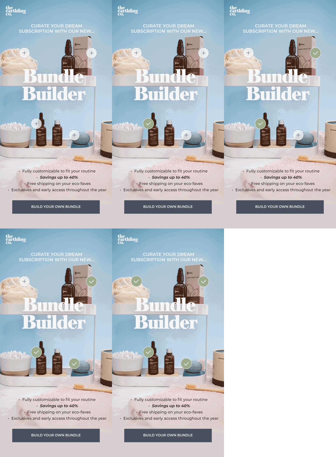
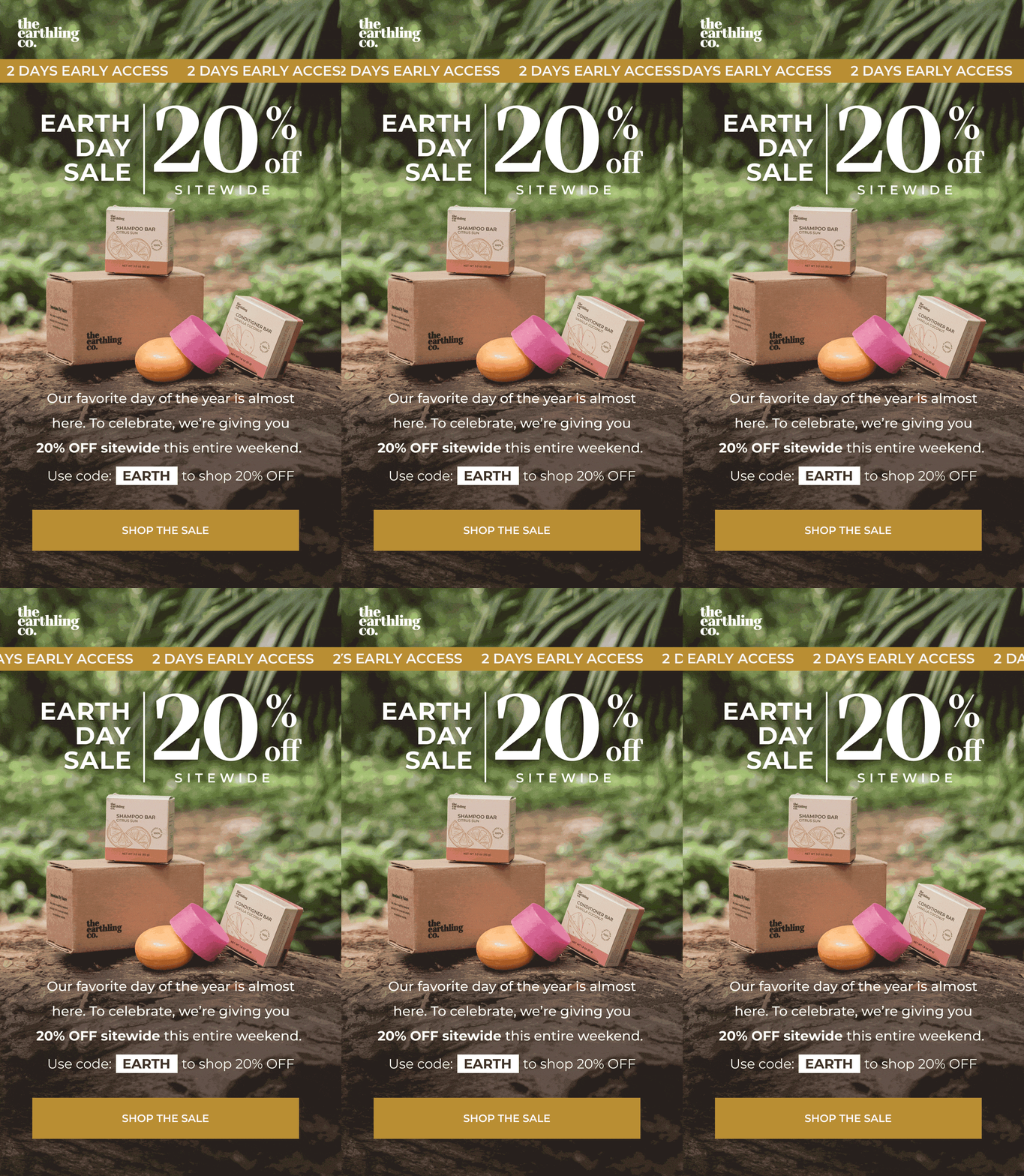
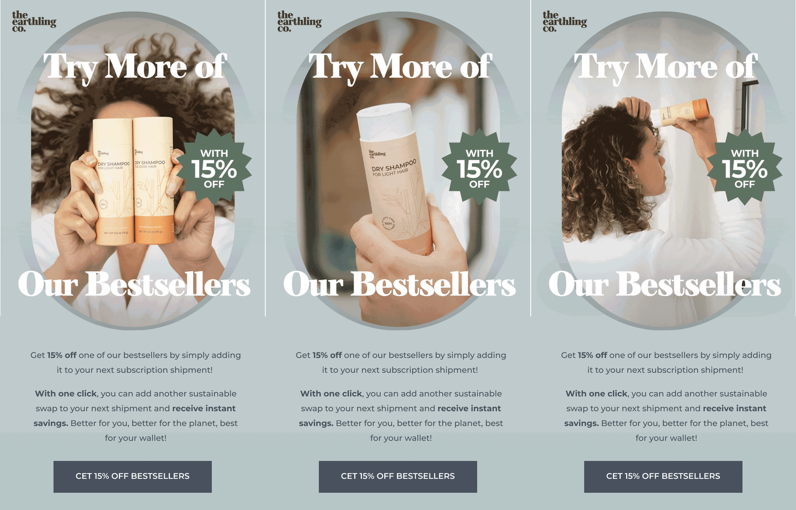
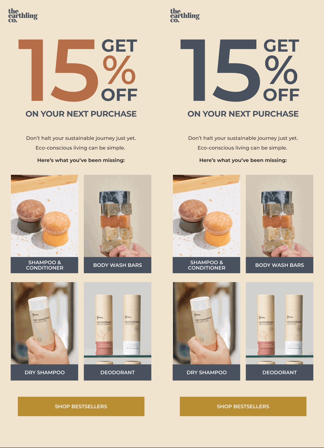
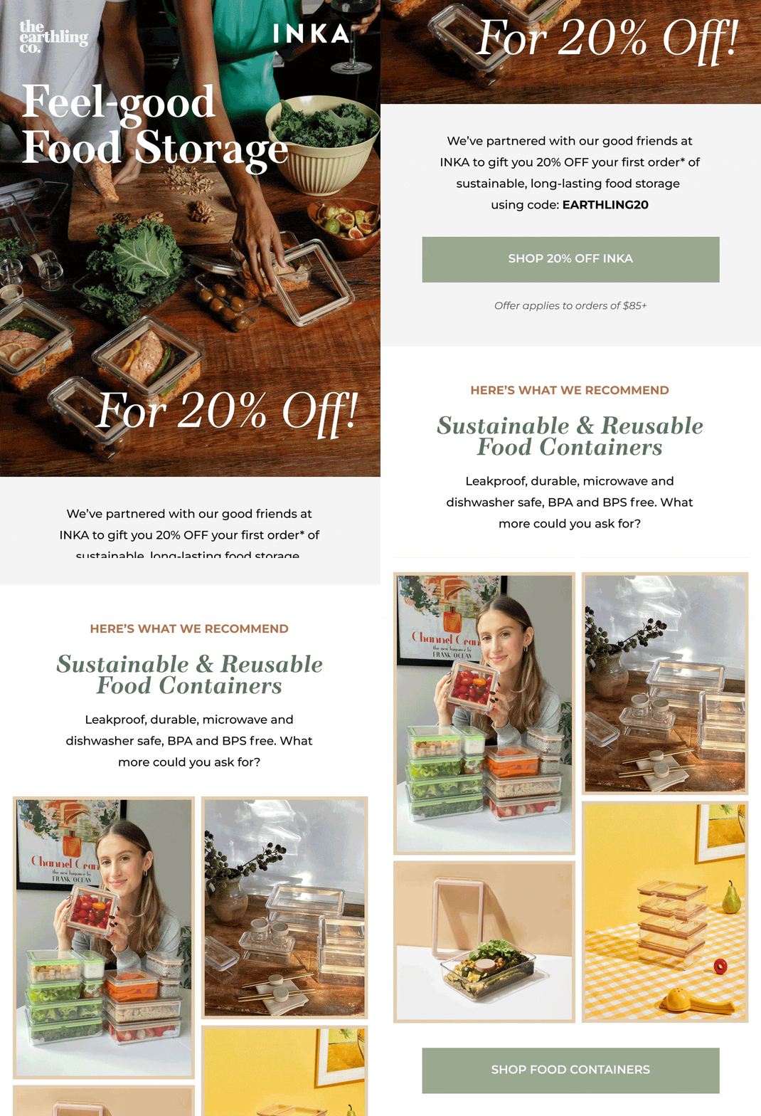
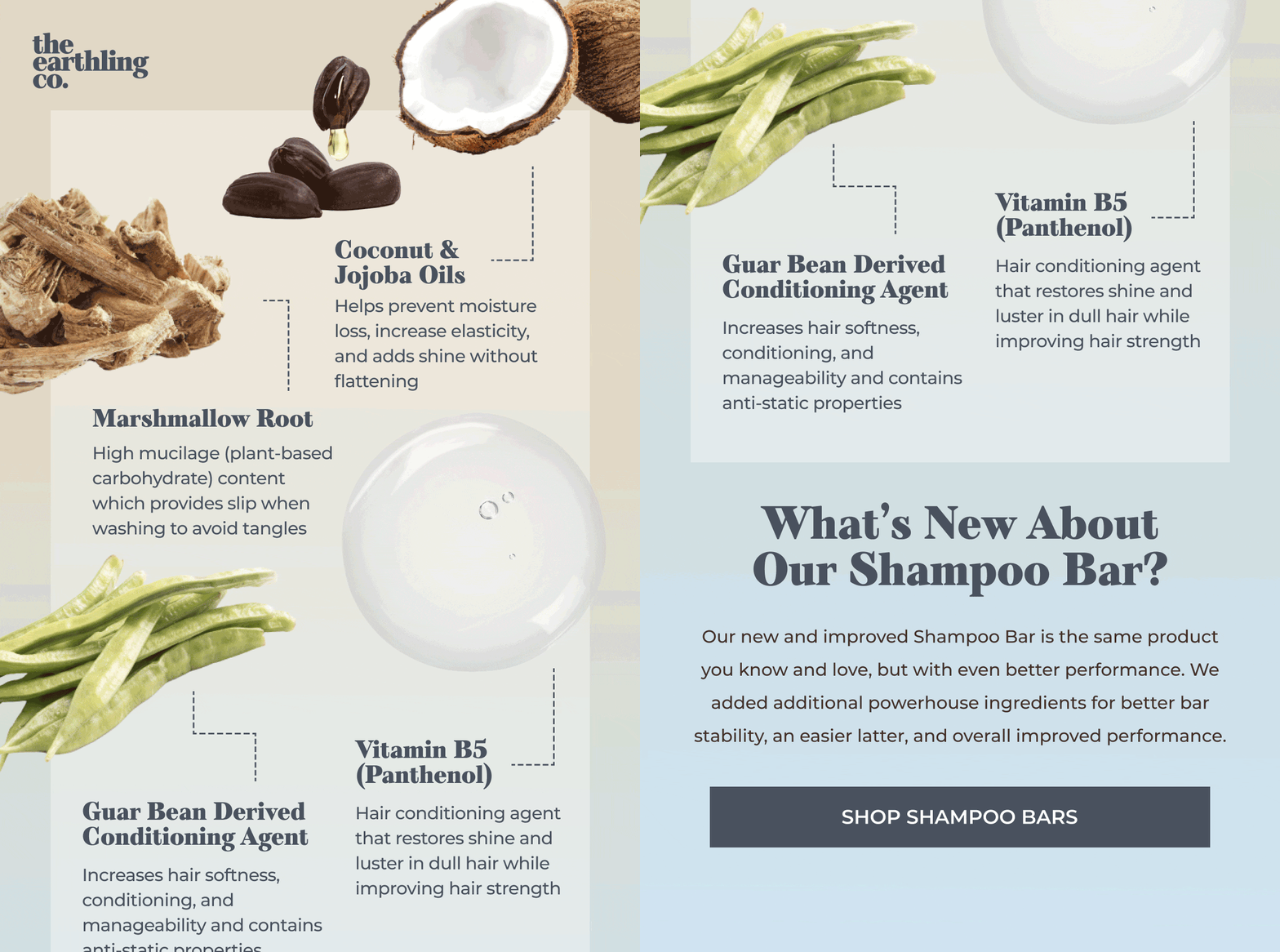
Emails
Click to fully view each email
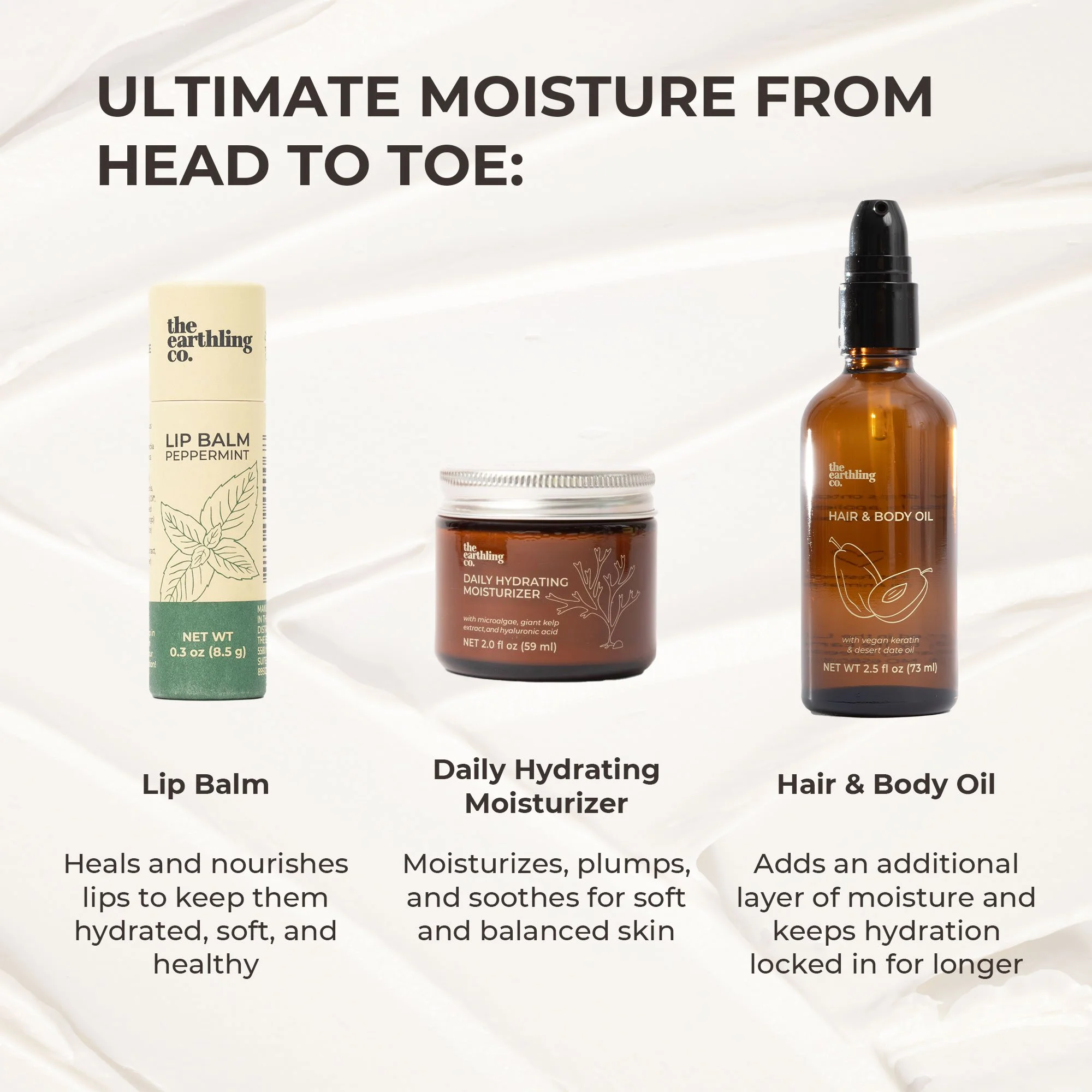
E-COMMERCE ASSETS
Product Detail Page Images, Banners, Infographics & Icons - For use on the website, & Amazon
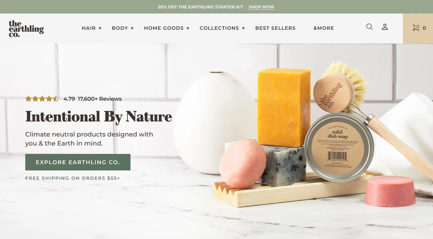
Web Design
Homepage Hero Banner Redesign - Wireframe
Desktop Hompage Wireframe
Mobile Homepage Wireframe
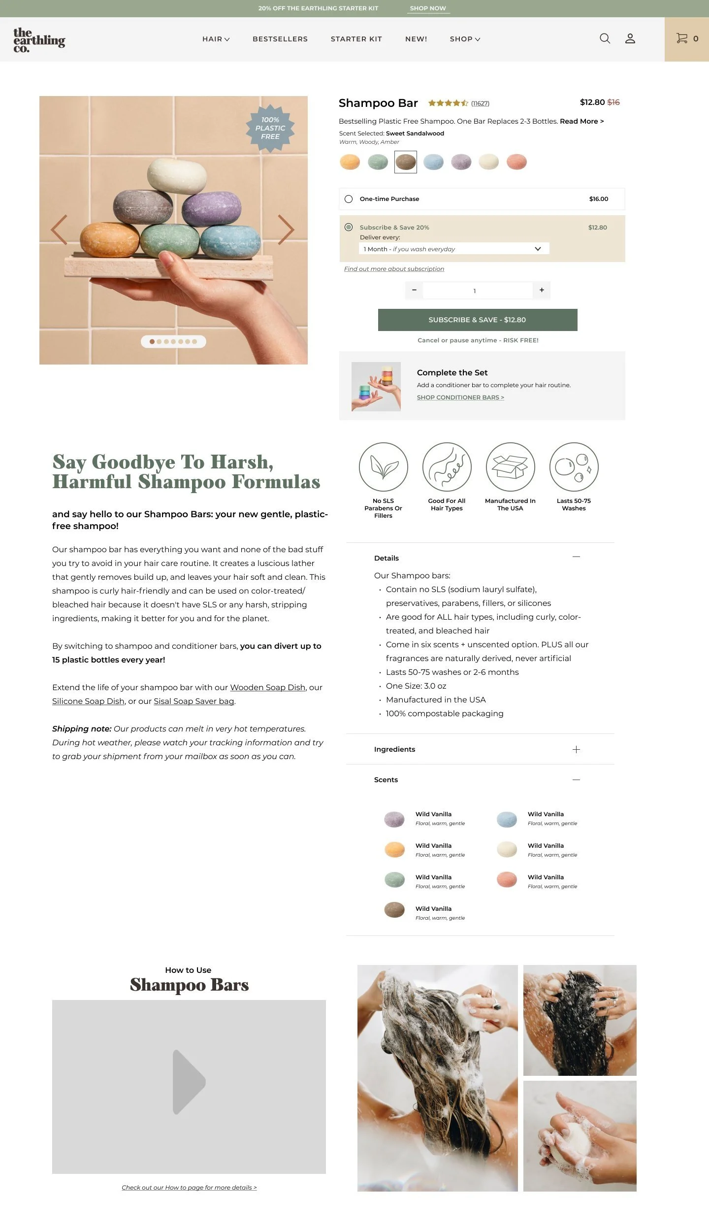
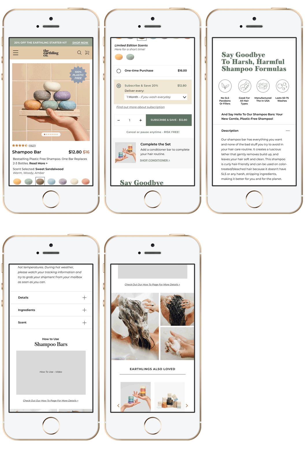
Product Detail Page Redesign - Wireframe
Product Detail Page HI-FI wireframe - Desktop
Product Detail Page HI-FI wireframe - Mobile
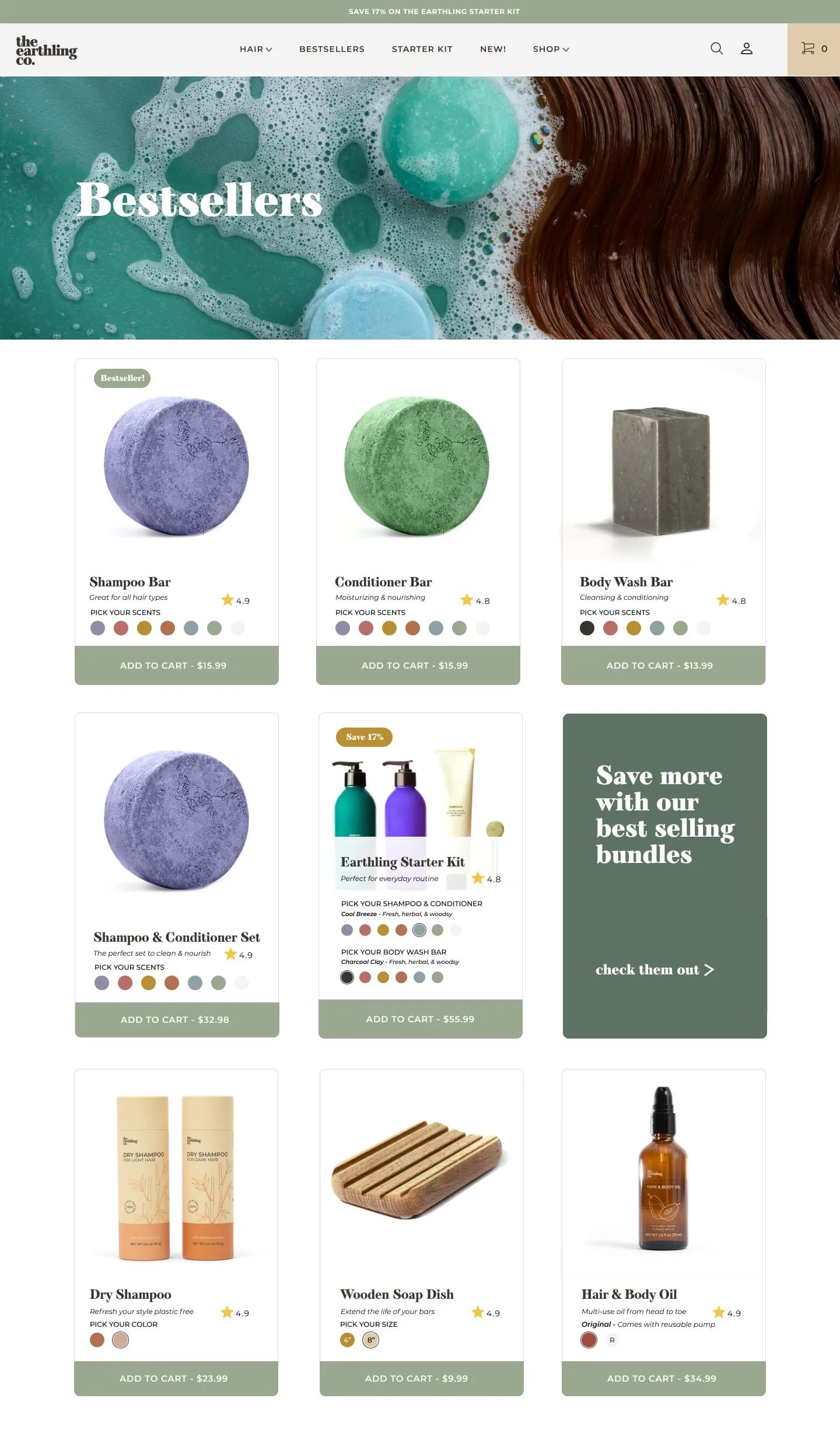
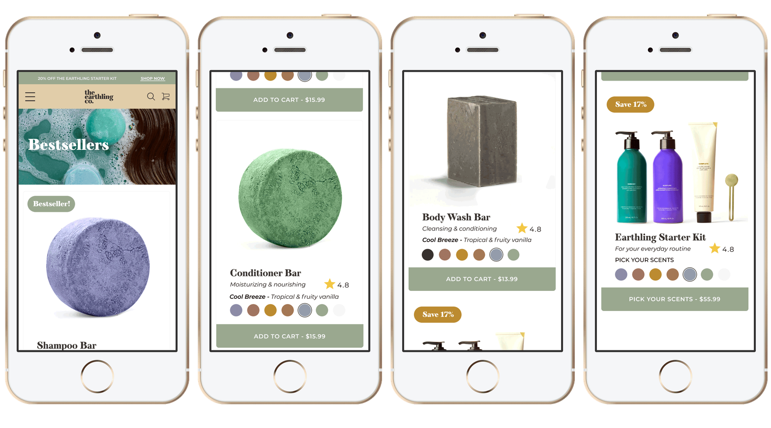
Collection Page Redesign - High Fidelity Wireframe
Collection Page HI-FI wireframe - Desktop
Collection Page HI-FI wireframe - Mobile


